
Introduction
It consisted of few basic pages like Home, Blogs, Events, About and Contact.
I chose Poppins to give the website a more modern look, and Orange Primany color, to match its name "Orange County.
Designs
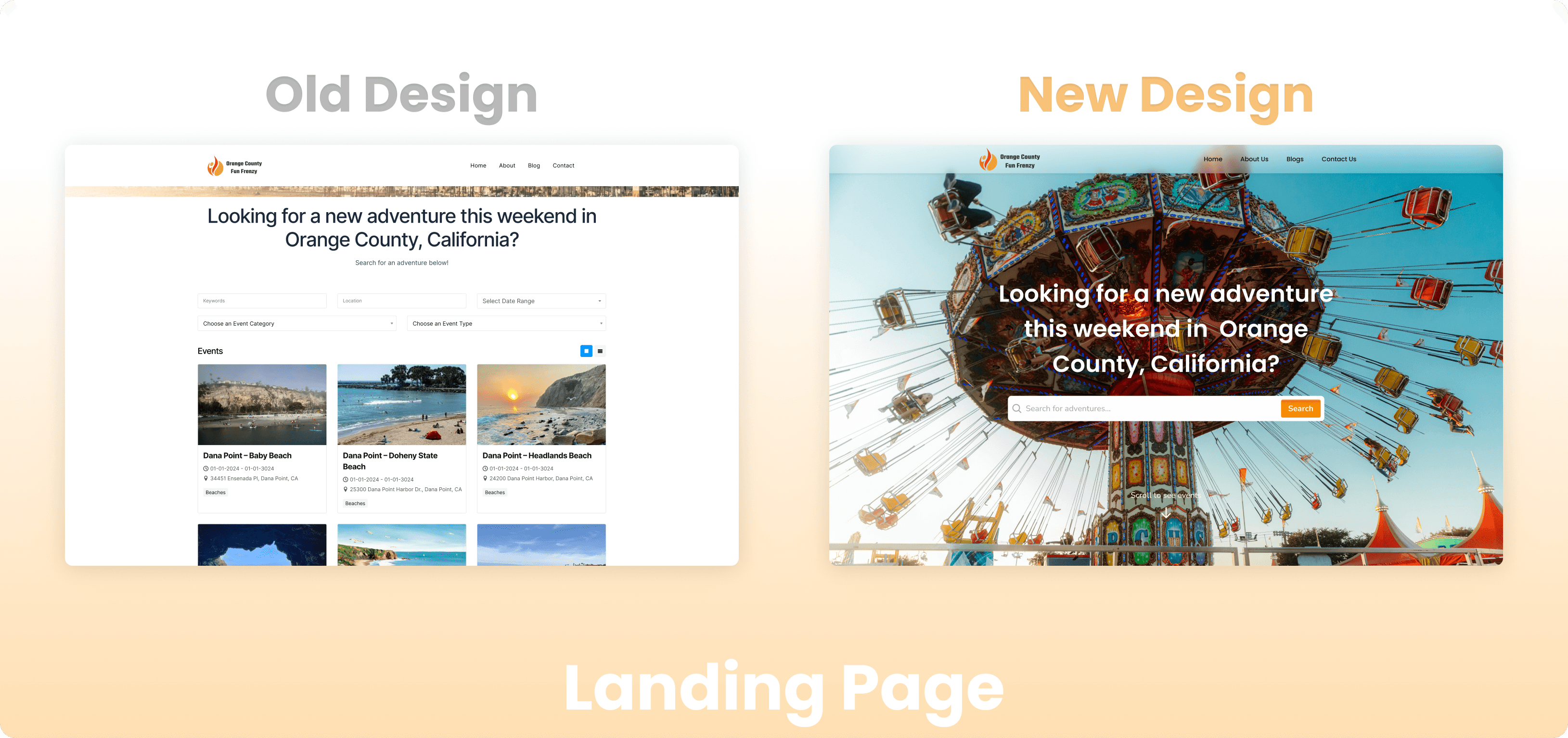
Landing Page
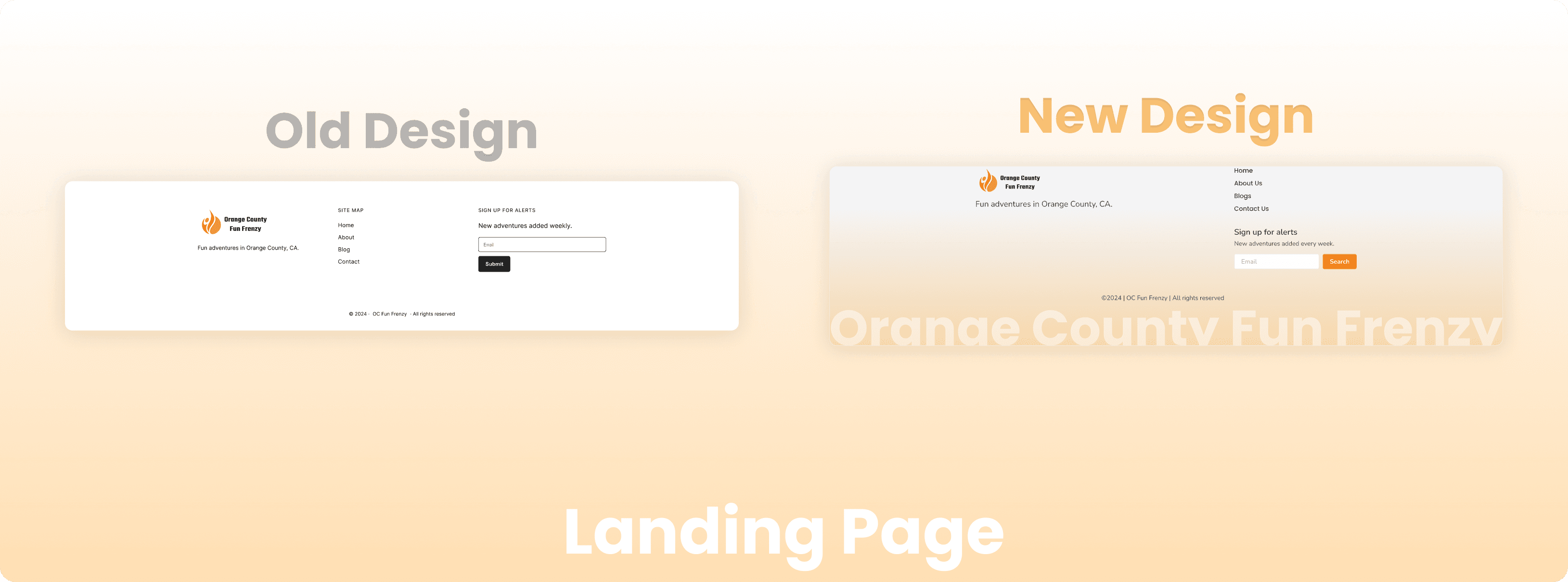
The old landing page was very boring, with no clear image or CTA button.
The new design has a image carousal and a search bar upfront.
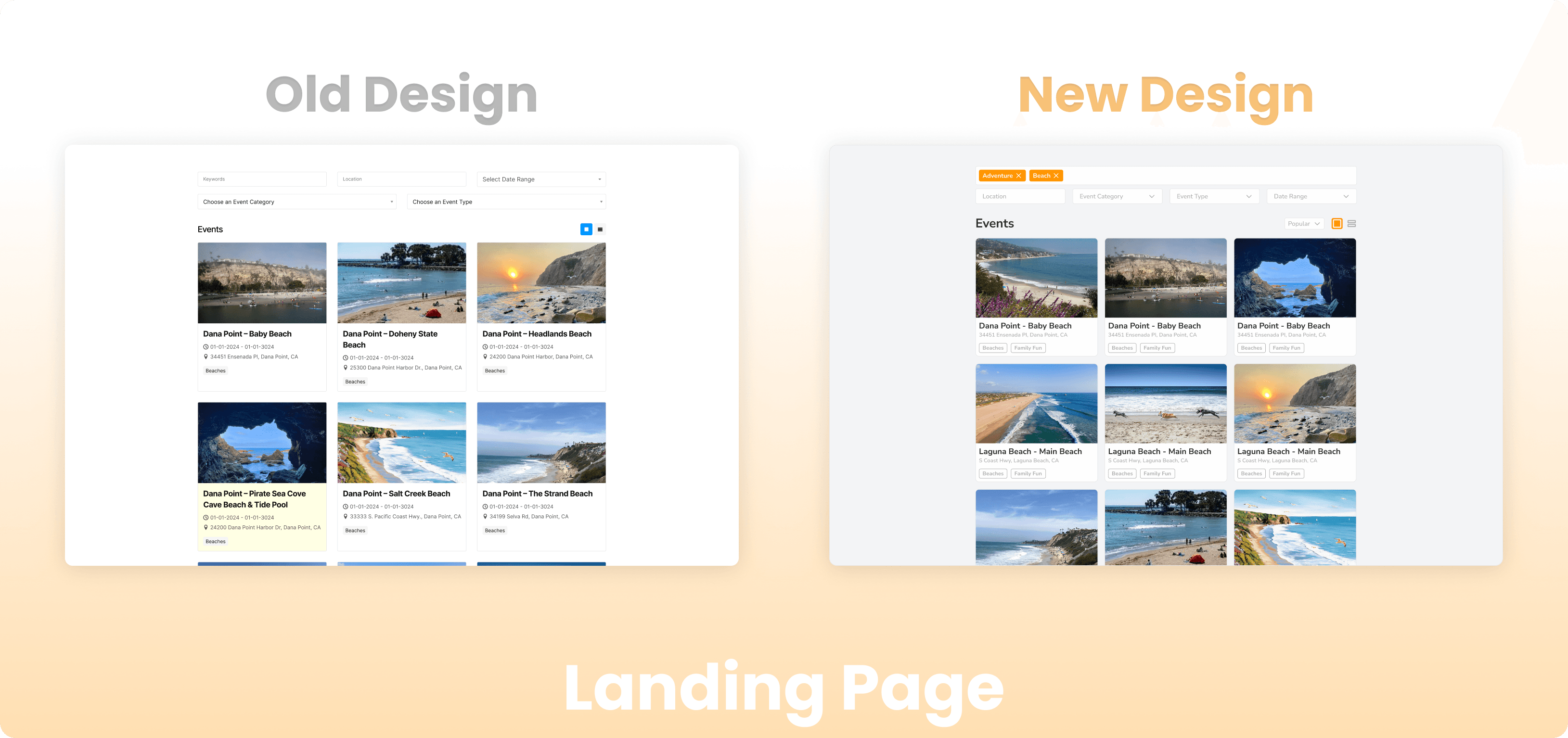
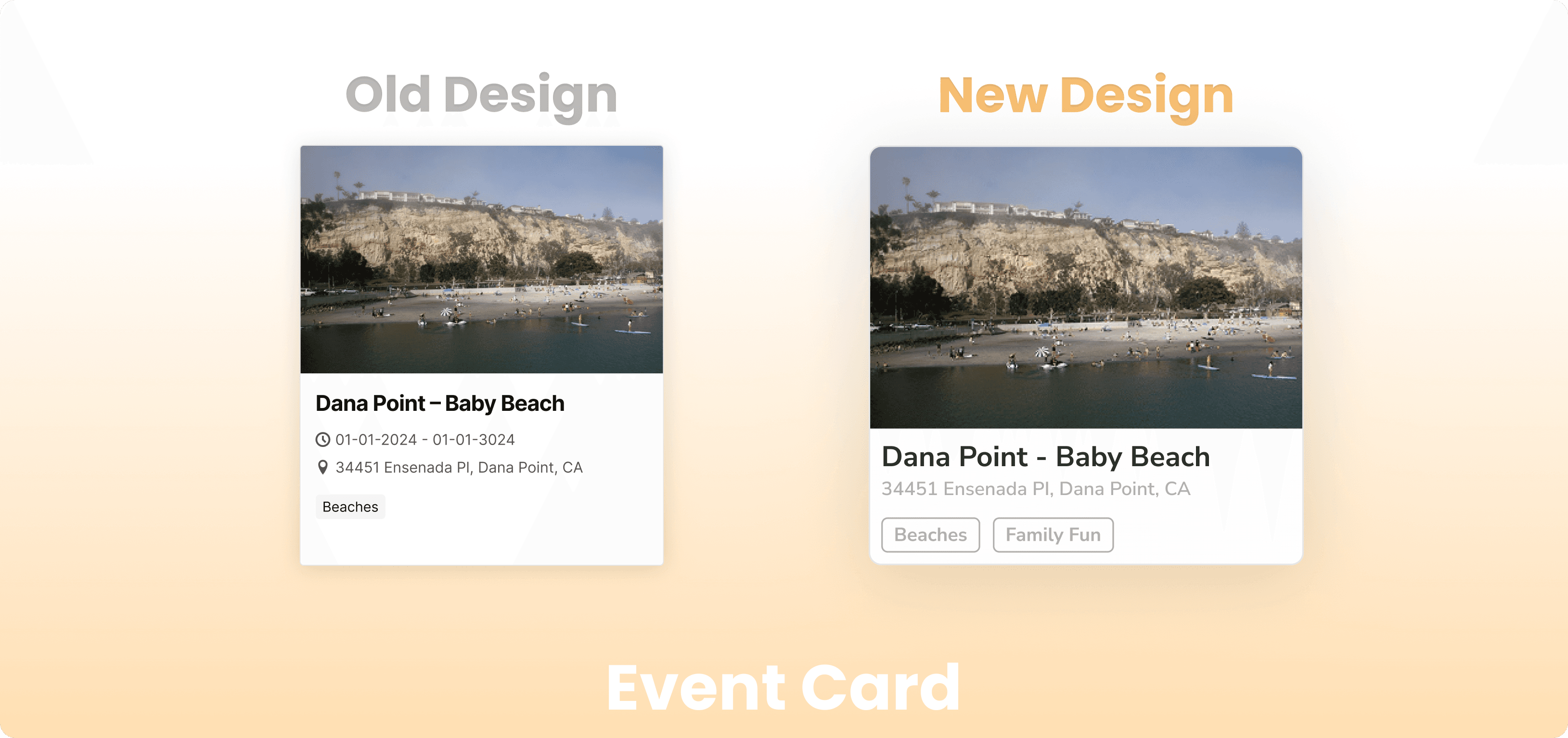
The old card also had some redundant information, that could be removed.
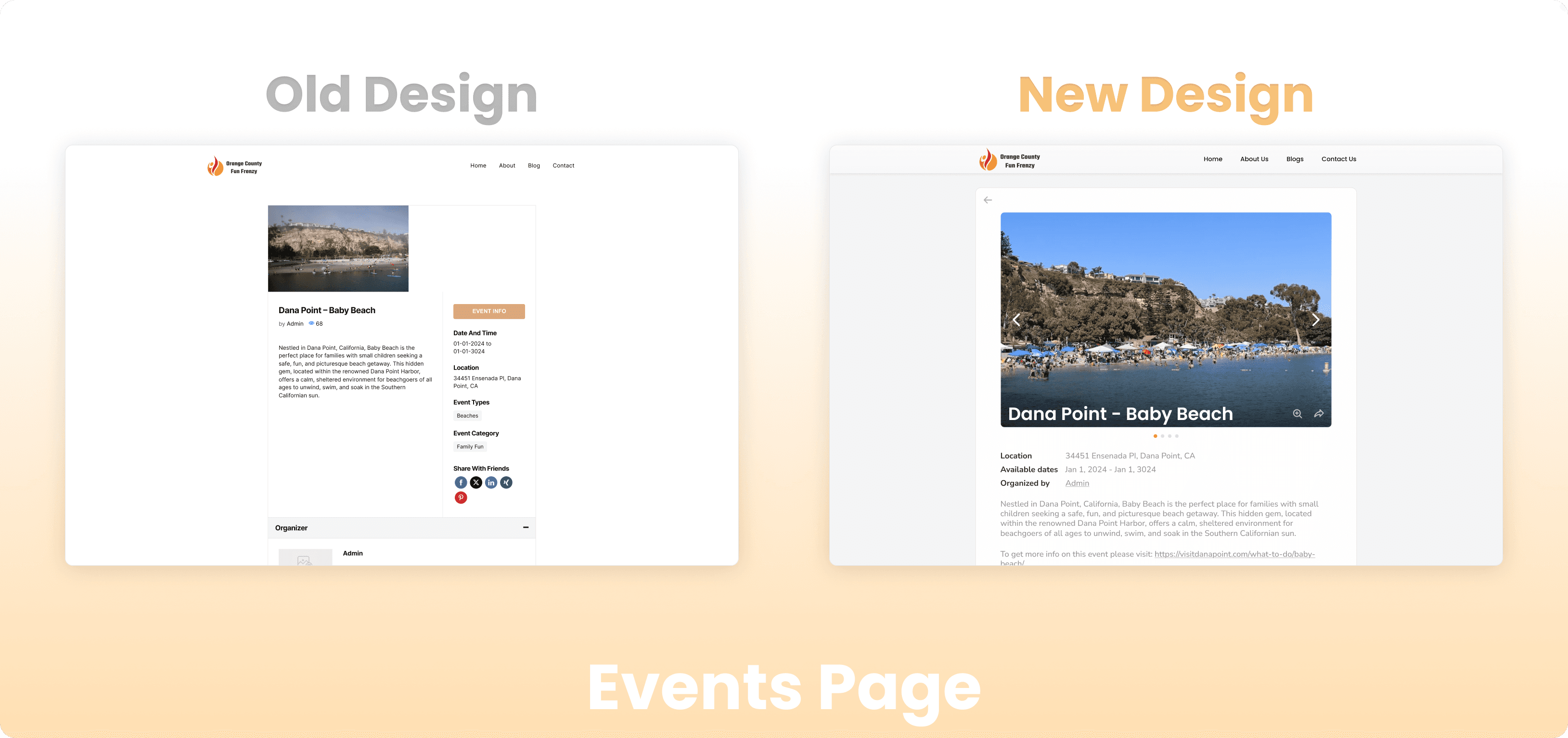
Events Page
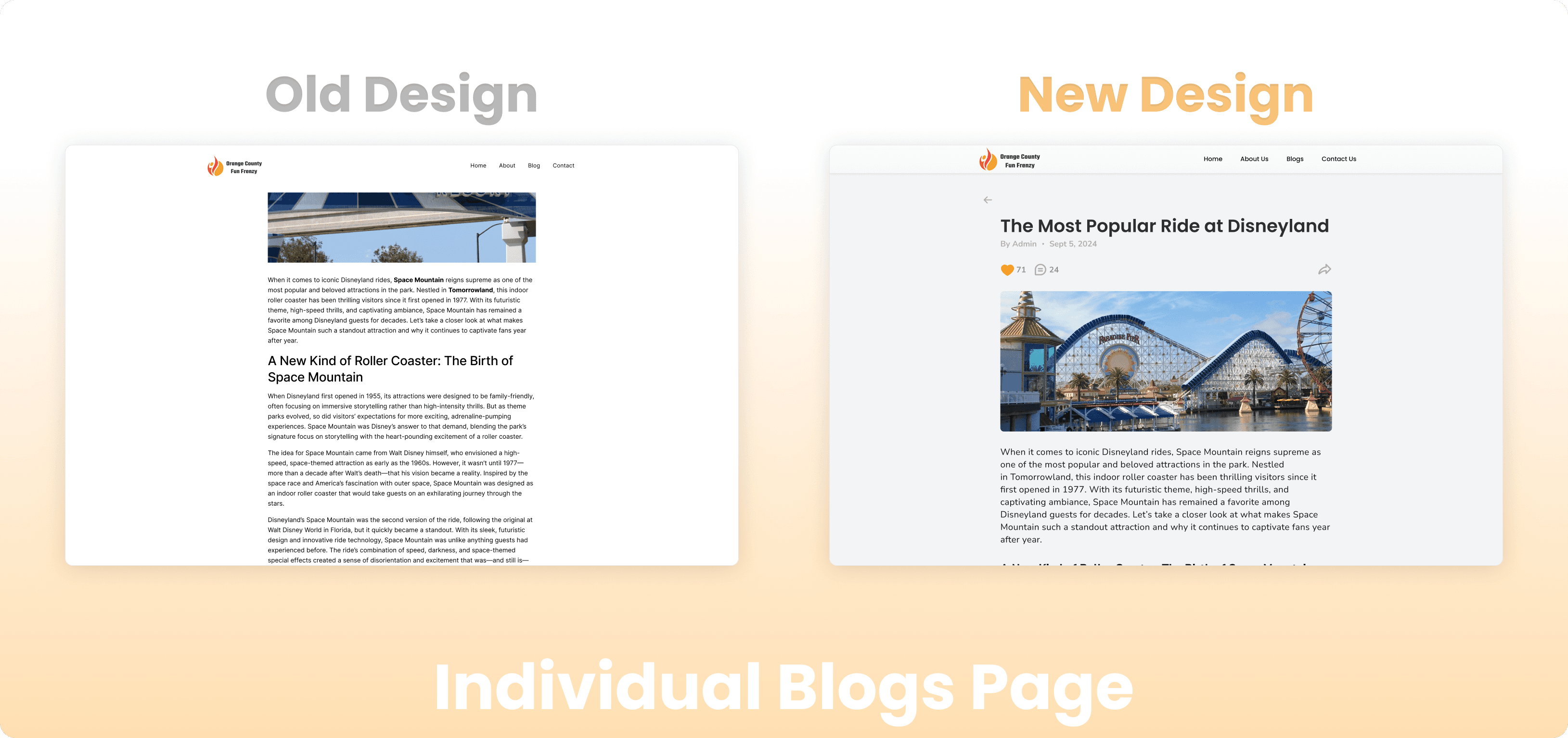
Blogs Page
The old blog cards lacked some description, to give the reader some context about the blog.
Also the page did not contain a search feature.
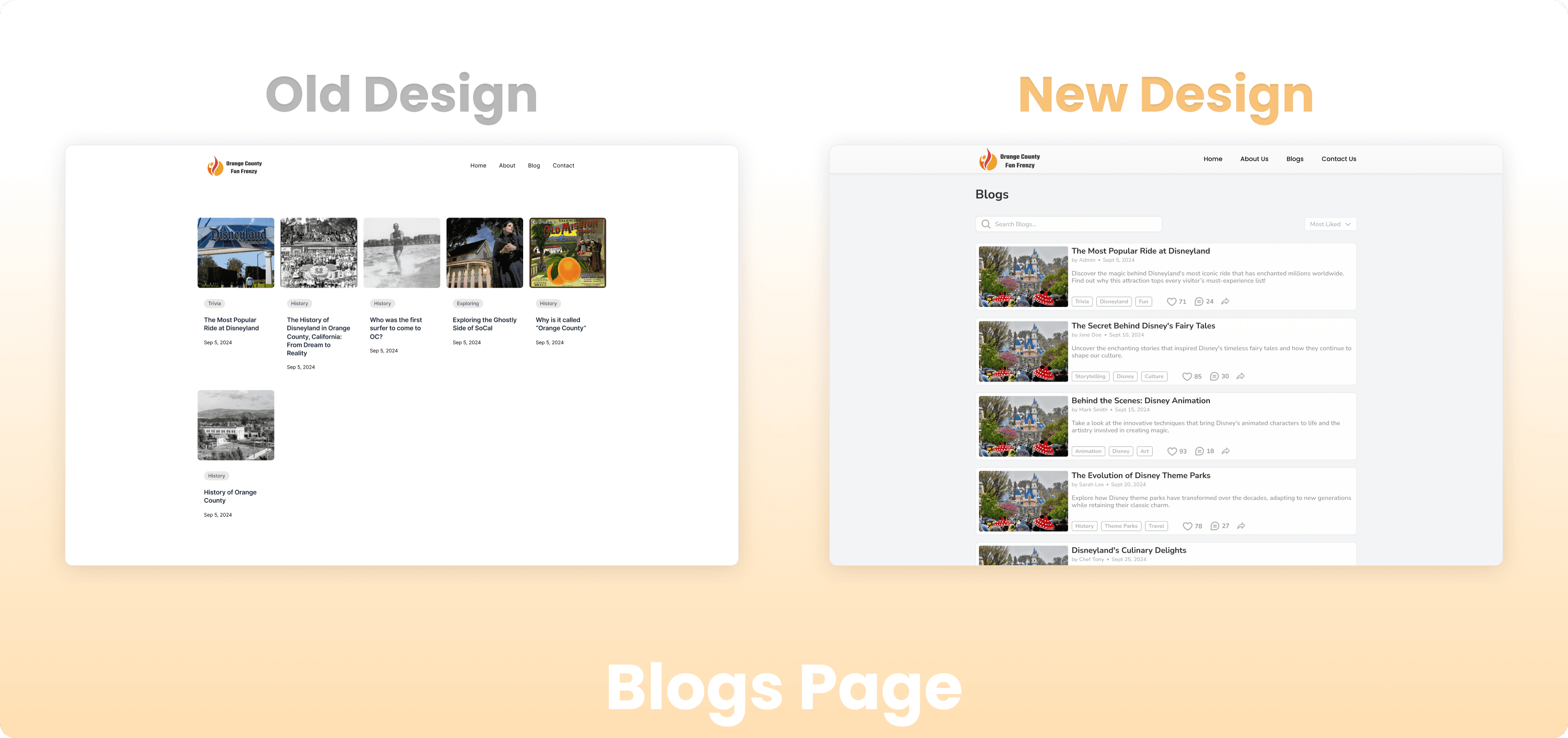
The new blogs now have a anonymous like and comments section. The texts are made more readable with increased line height and breathing space.
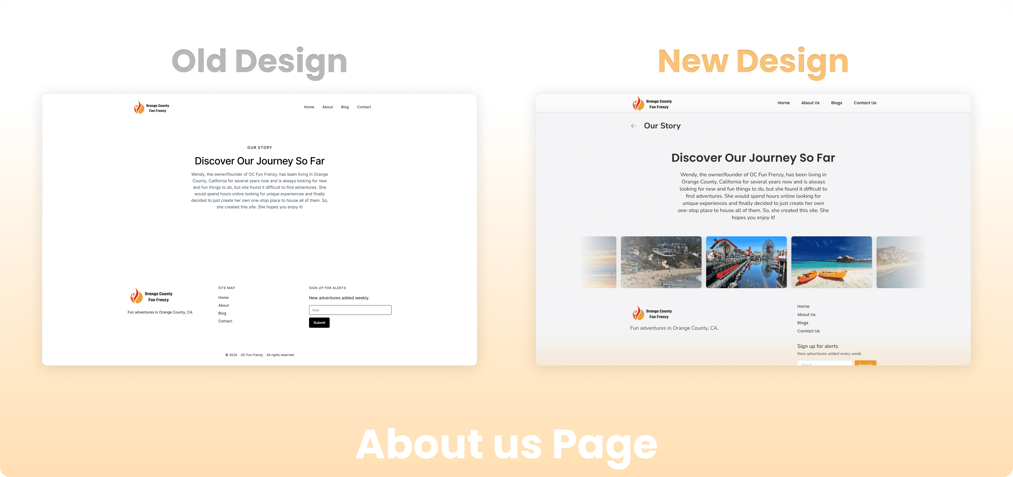
About us Page
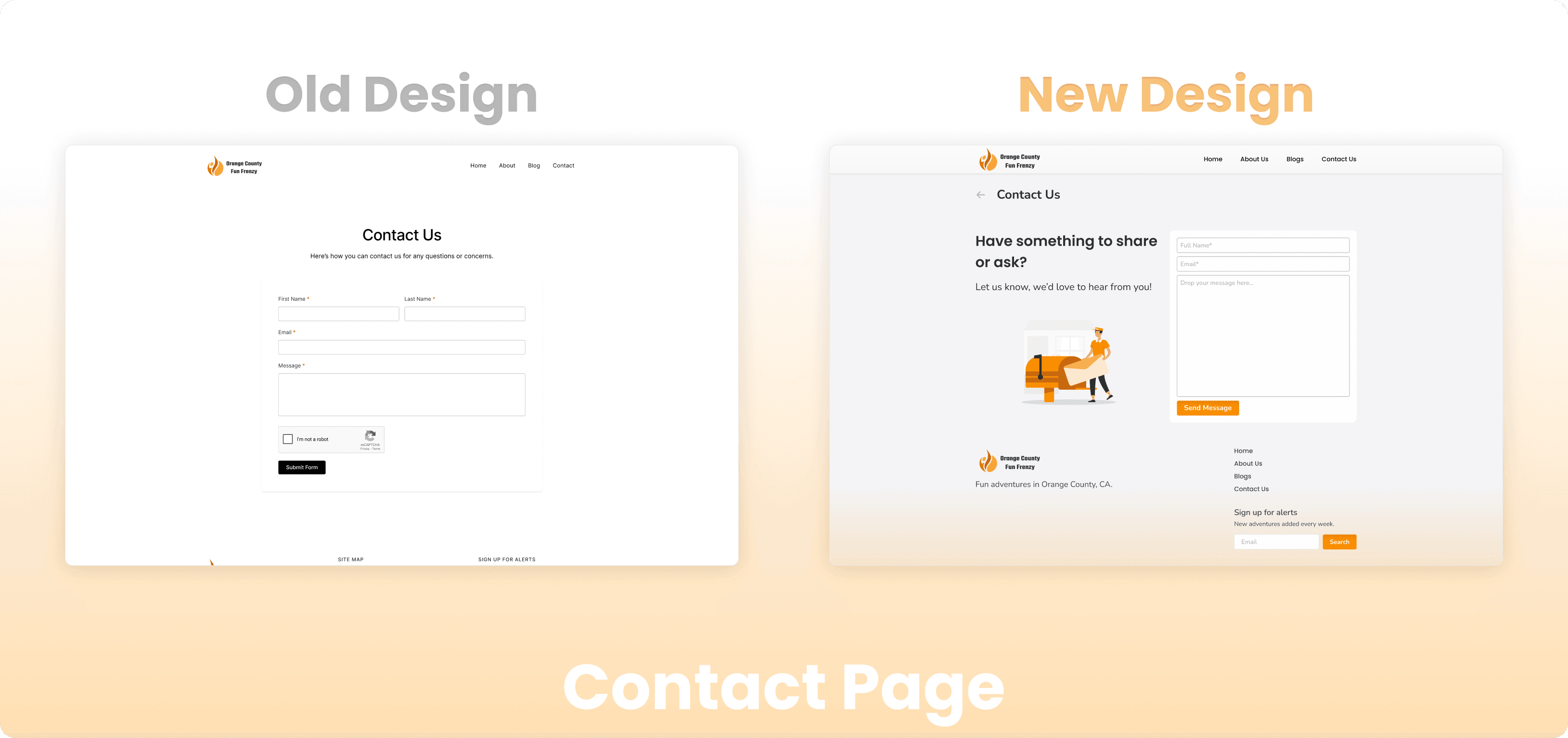
Contact Page
Final Thoughts
This project was a quick UI redesign with not much UX, but this helped my client to have a newer and fresher looking personal blog website.
Other Works
From Pixels to Production: Building Swiggy Scenes’ AI-Powered CRM
Redesigning the User Interface of a Blog Website
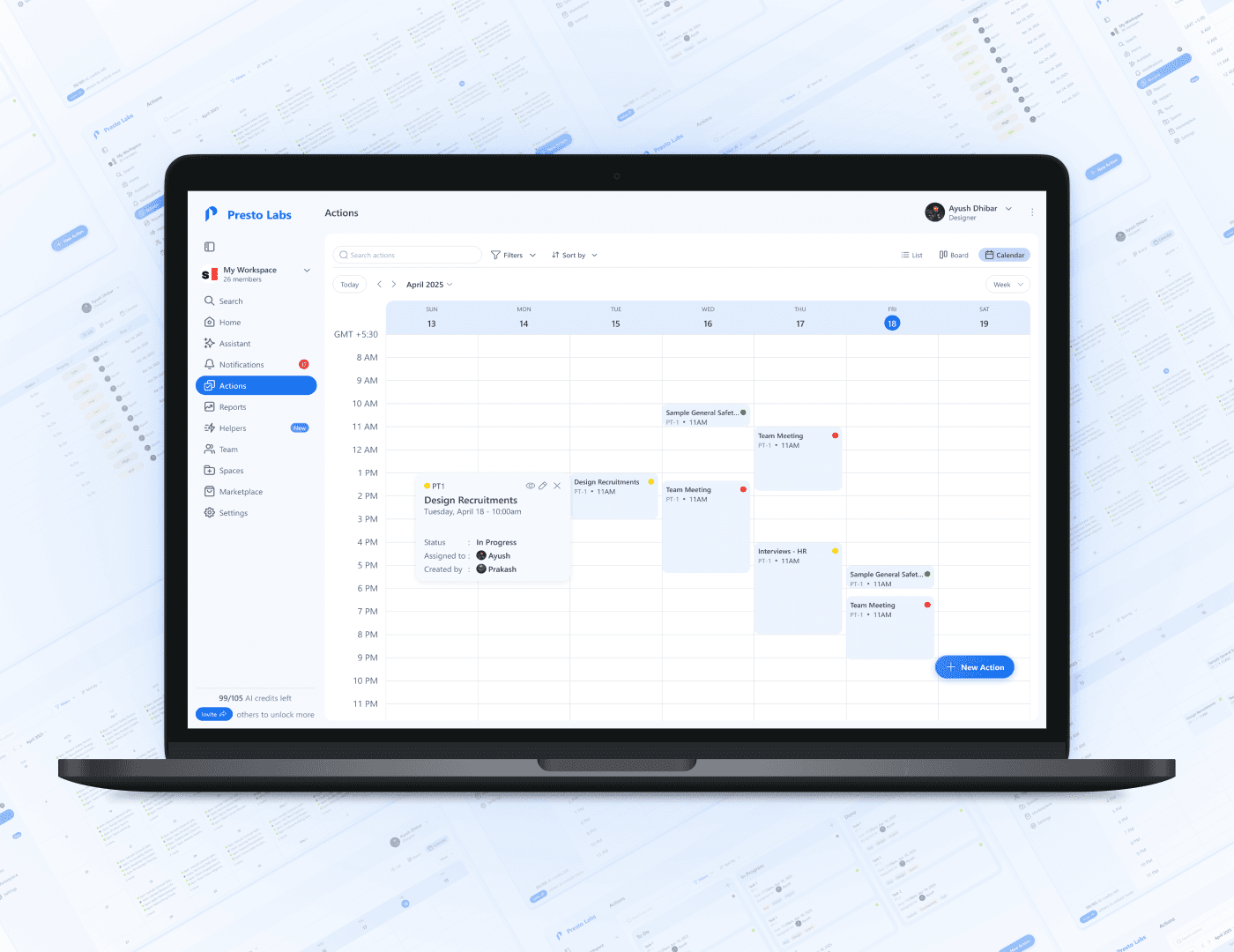
Redesigning the UI of Presto to enhance the UX

Meals: Smart Meal Planning Meets Instant Grocery
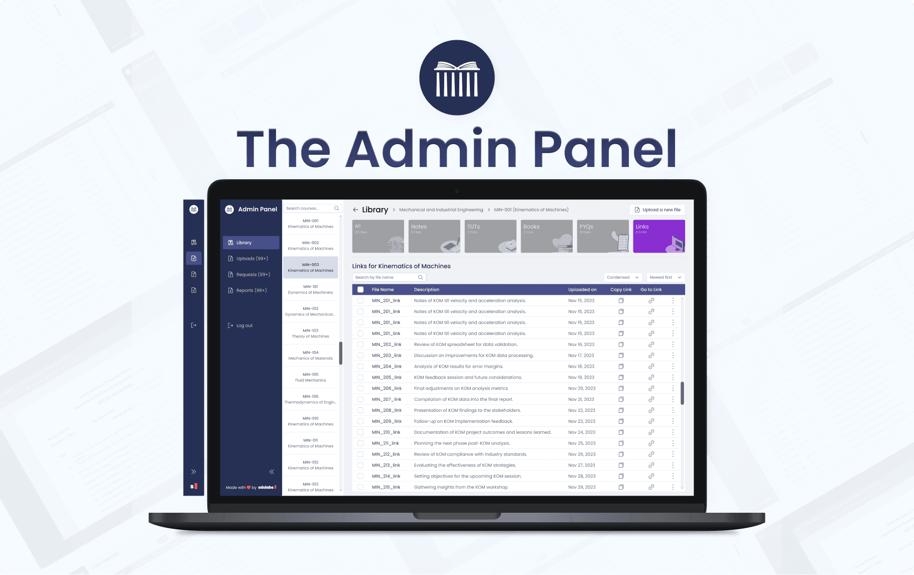
Improving the Admin Panel User Experience of Study Portal: A Case Study

Improving the Workflow of the Swiggy Dineout Sales Team — A Case Study