
Introduction
Throughout the assignment my main motive has been to improve the User Experience and the User Interface in the Actions Page.
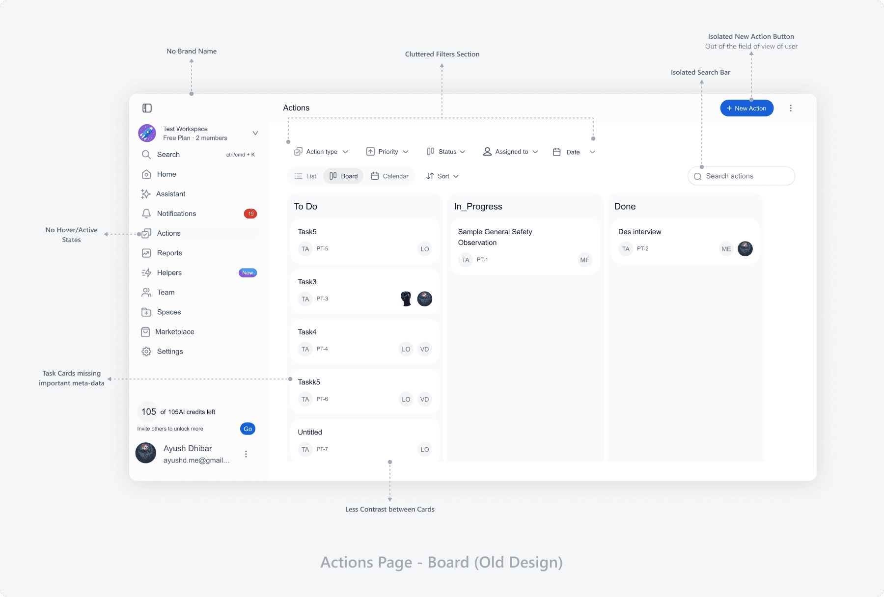
Board - Cluttered Filters Section, Isolated Search bar.
The first noticeable problem is the cluttered filters section.
Too many filters feel overwhelming for the user.
They take up a lot of vertical space, hence reducing the main workspace area.
Task Cards needed revision, as it was missing important data, and had some redundant elements
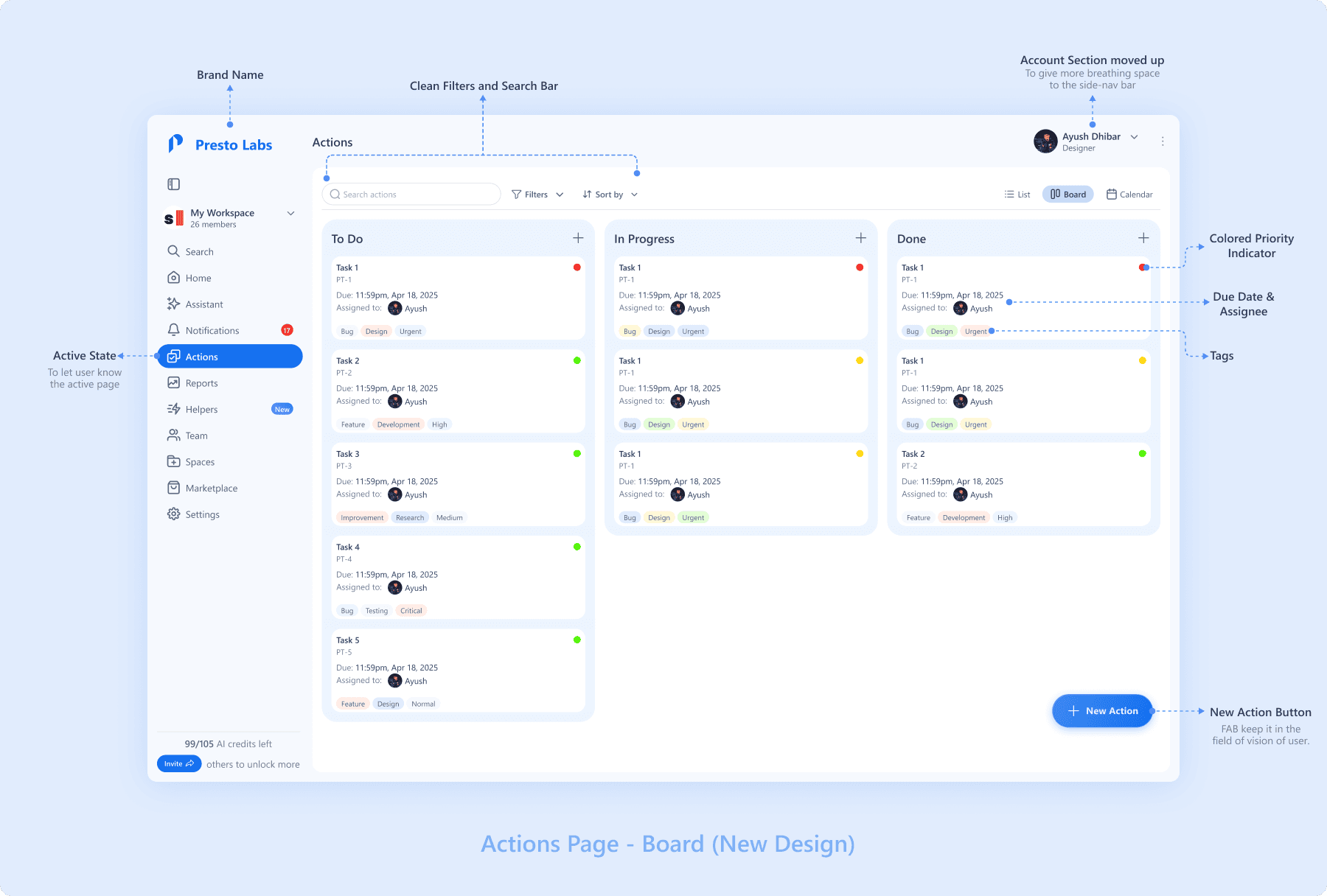
Solution:
I created a collapsible filters section that can be hidden when not needed.

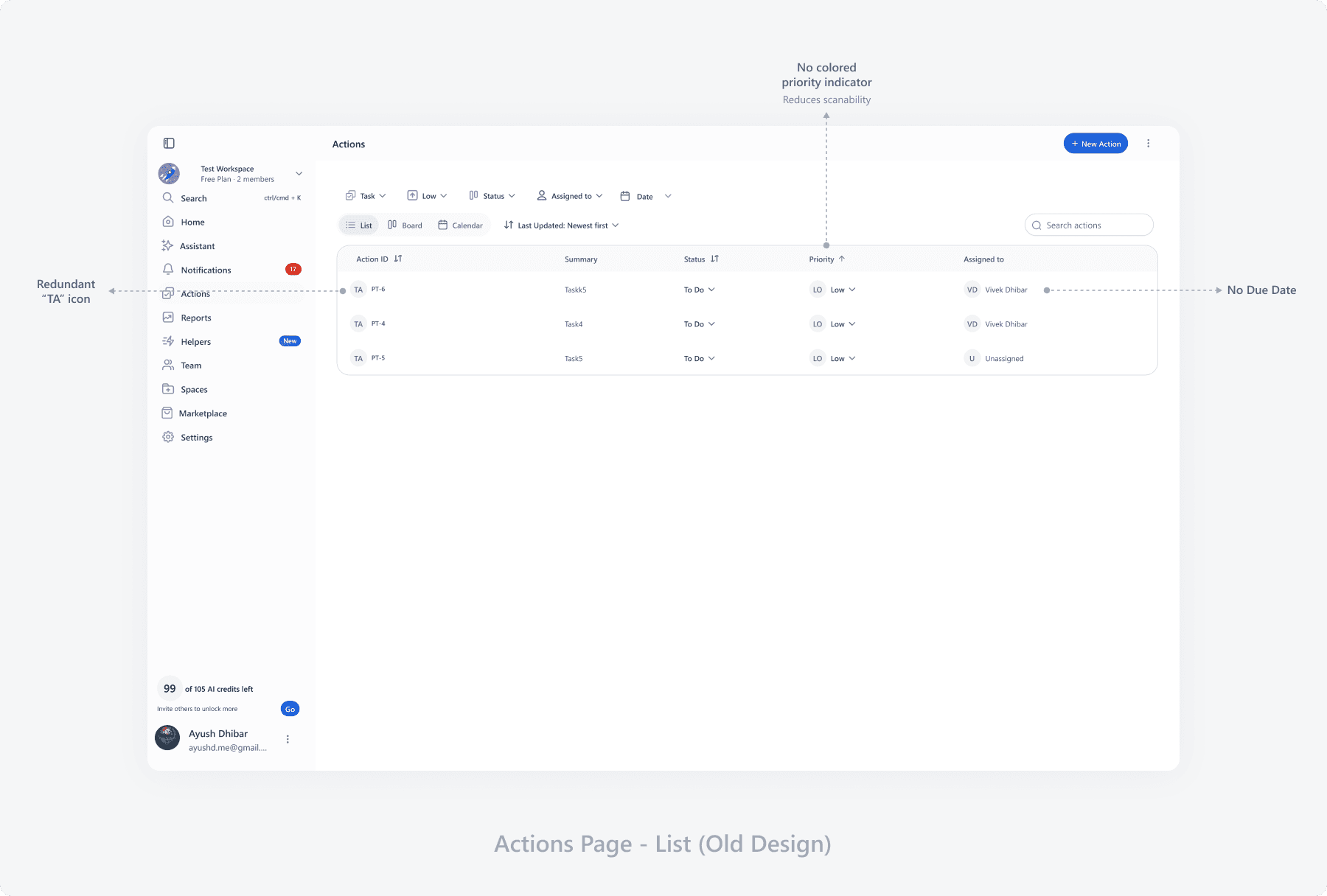
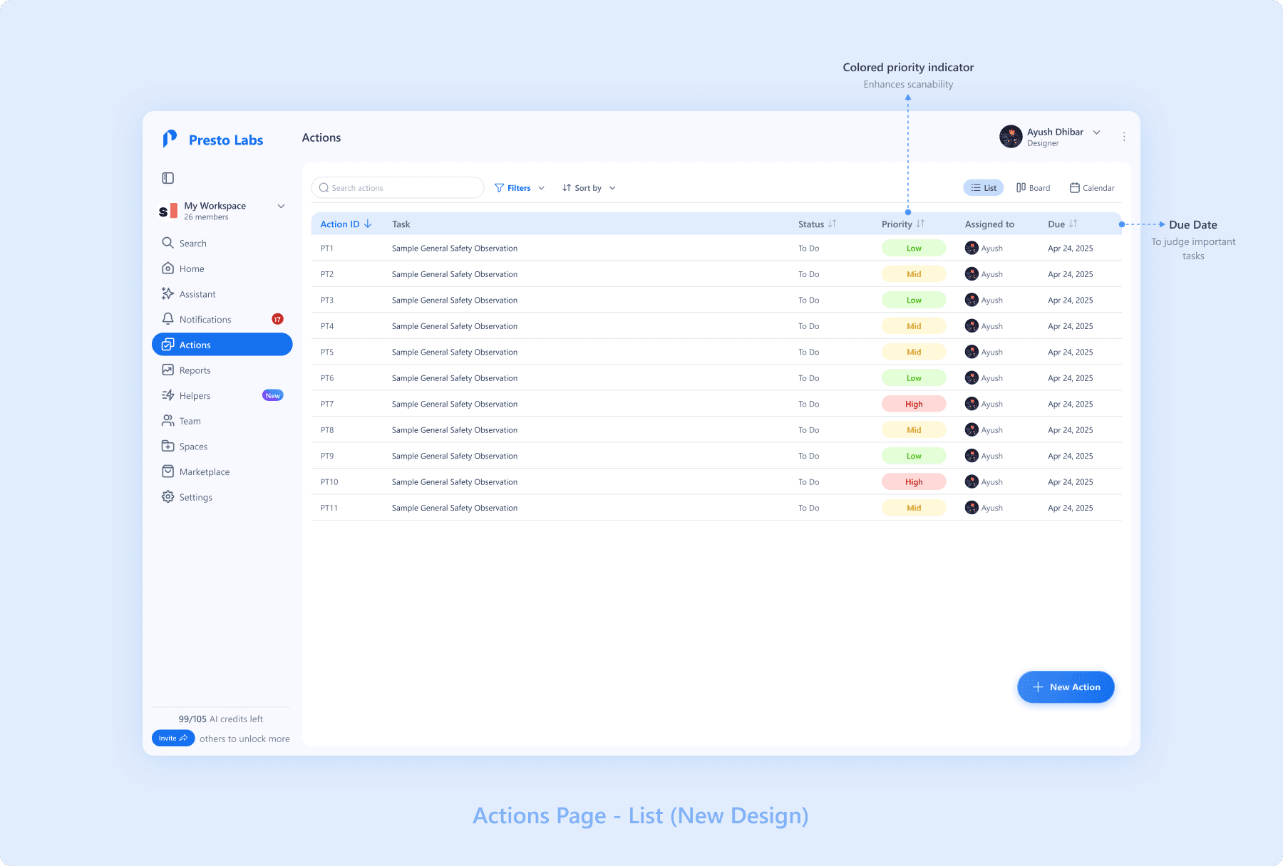
List - Improved UX
The list view also had some problems -
Lacked data like Due Date
Had some redundant elements like - "TA" icon
Had Hierarchy issues
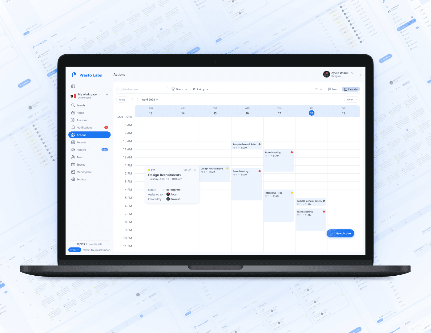
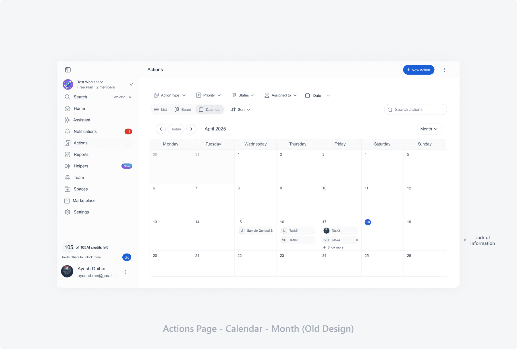
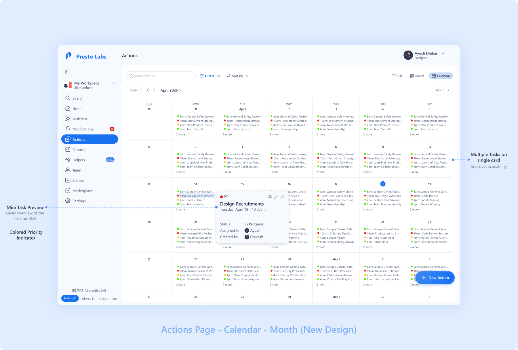
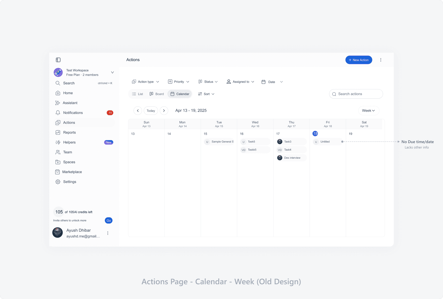
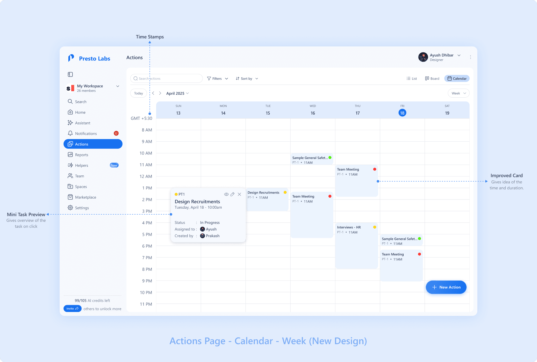
Calendar
Even the Calendar view lacked important information, priority indicator, and showed less tasks per card, this greatly reduces scalability.
Month View
Week View
Conclusion
The proposed redesigns would improve the User Experience and User Interface and make it easier for the users to use the Actions Page.
Other Works
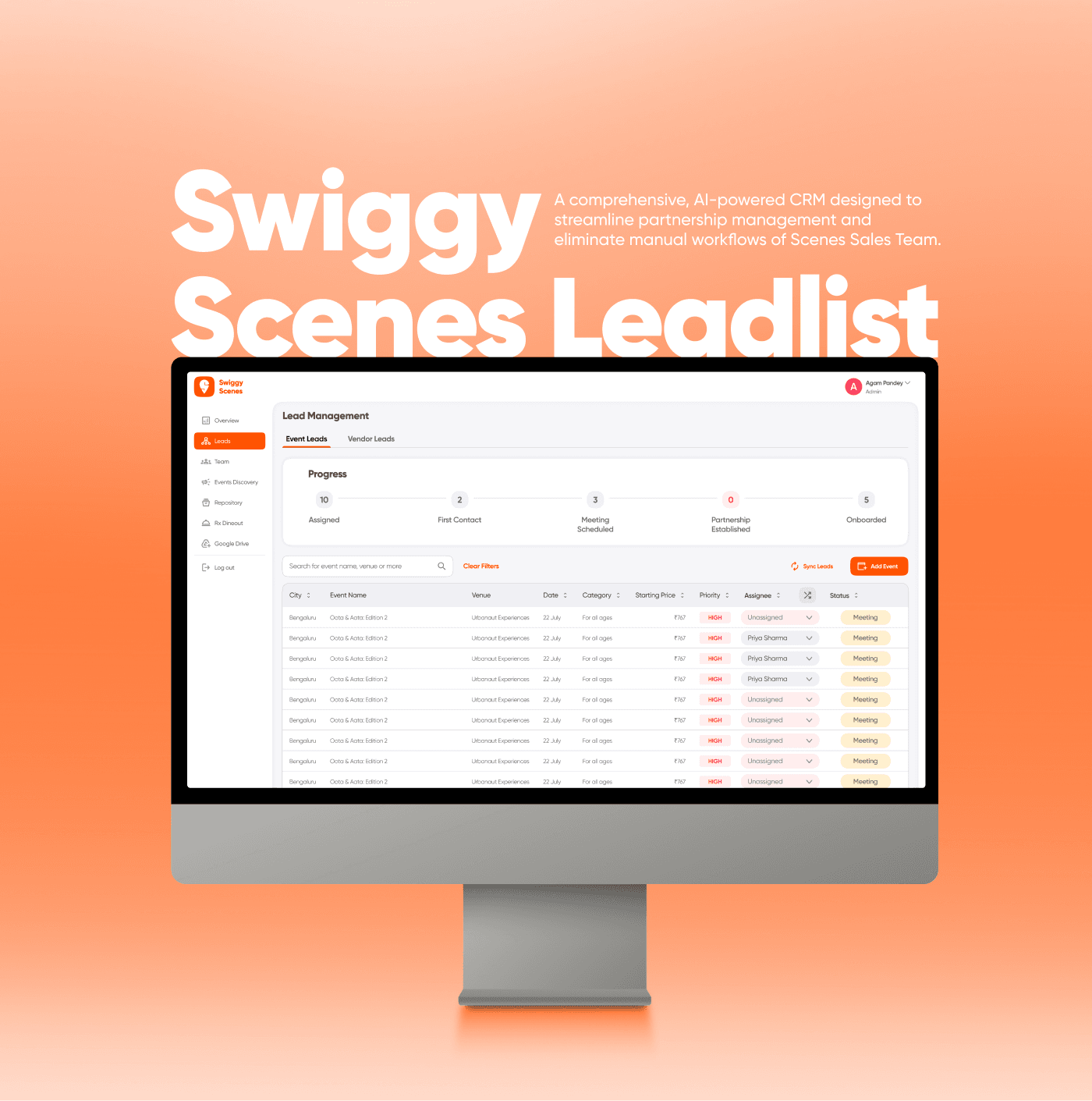
From Pixels to Production: Building Swiggy Scenes’ AI-Powered CRM
Redesigning the User Interface of a Blog Website
Redesigning the UI of Presto to enhance the UX

Meals: Smart Meal Planning Meets Instant Grocery
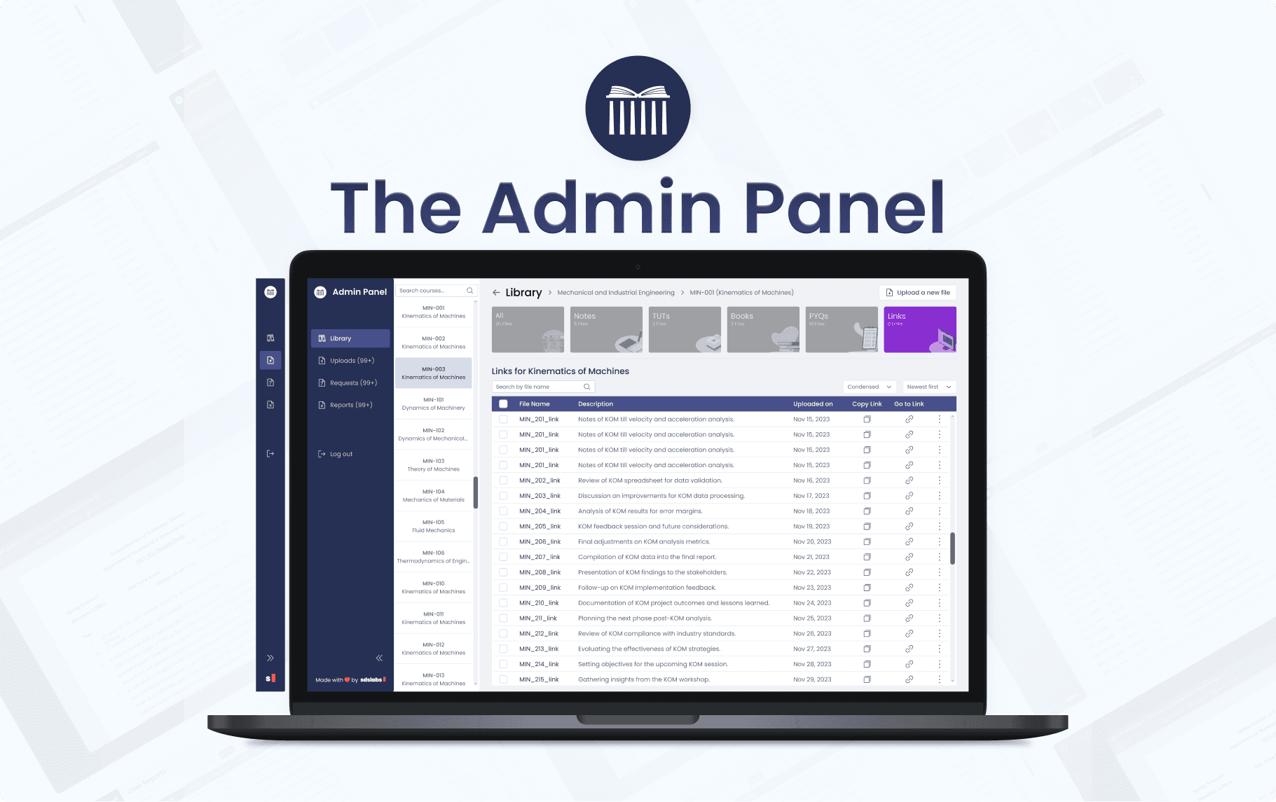
Improving the Admin Panel User Experience of Study Portal: A Case Study

Improving the Workflow of the Swiggy Dineout Sales Team — A Case Study